
TRAG
BRAND KIT / WEB3 TRADINGLogo, dimensional mark, typography, colour and usage rules for a Solana trading terminal, built by IDAEVIA.
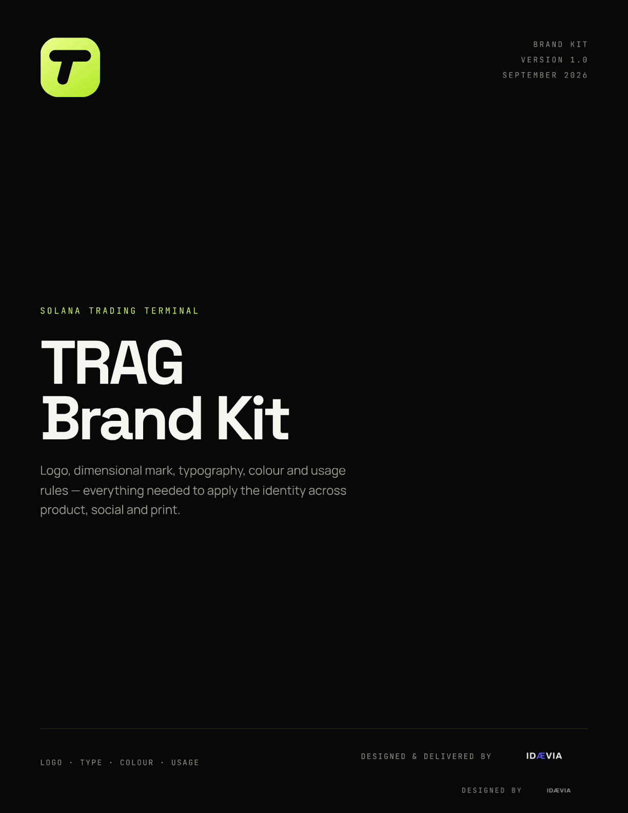
Every trade leaves a trace. The TRAG identity is built on that single idea: a mark that already looks like it is moving, a palette with exactly one signal colour, and numbers always set in mono so a rate is never mistaken for prose. The kit covers construction, four plate variants, the 3D dimensional mark, wordmark and lockups, misuse, colour, typography, applications and a full asset index.
Client
TRAG
Sector
Web3 · Solana trading terminal
Deliverables
11-page brand kit + SVG and 2x PNG asset set
Year
2026
Brand system
● Brand kitV1.0 · 2026
T
TRAG
Solana trading terminal
Space Grotesk · 84 / 700 · -4.5% tracking
FAST BEFORE
PRETTY.
PRETTY.
BuySell$TRAG / SOL · +18.4%
T
T
T
Gallery
What is TRAG?
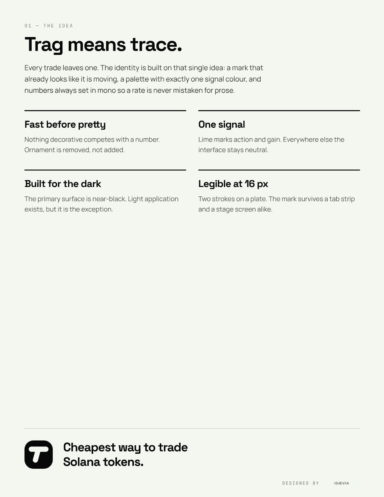
Every trade leaves a trace. The TRAG identity is built on that single idea: a mark that already looks like it is moving, a palette with exactly one signal colour, and numbers always set in mono so a rate is never mistaken for prose. The kit covers construction, four plate variants, the 3D dimensional mark, wordmark and lockups, misuse, colour, typography, applications and a full asset index.
How it works
- 01Idea and construction
- 02Variants and the 3D mark
- 03Wordmark, colour and typography
- 04Applications and asset handoff
What's inside
01
A mark that moves
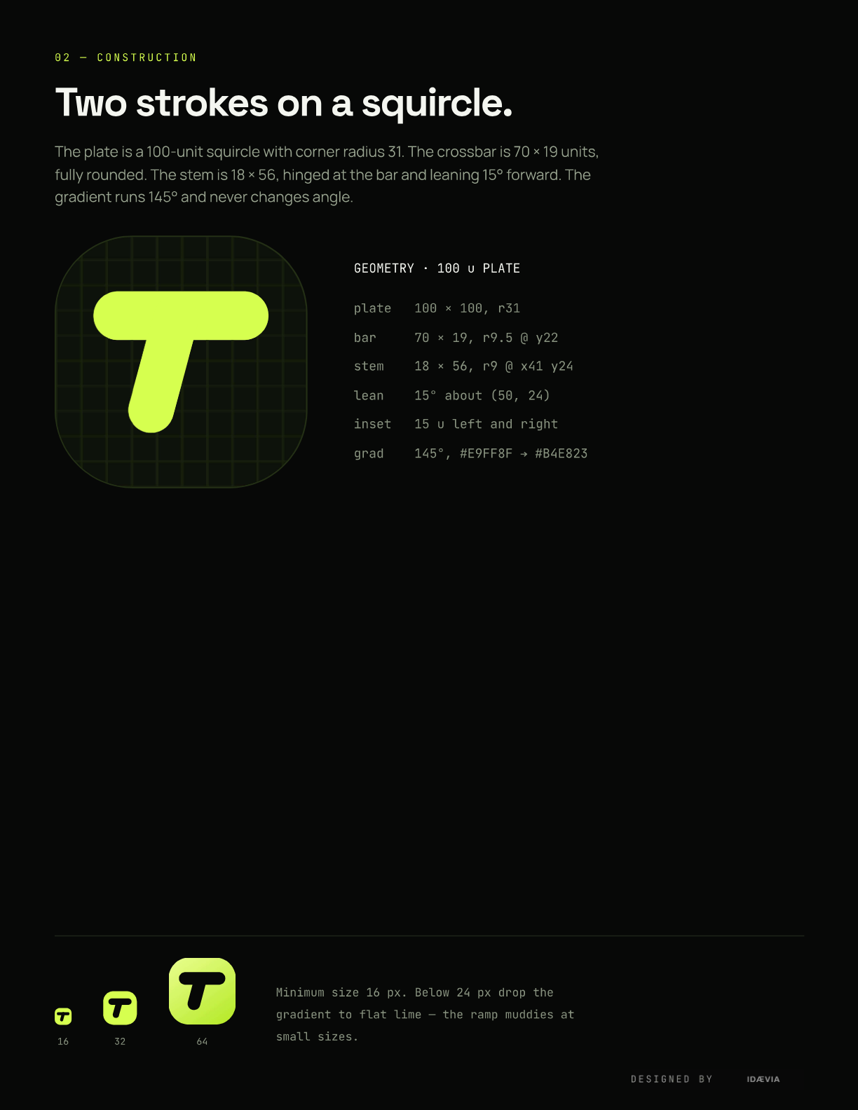
Two rounded strokes on a squircle plate, the stem leaning 15 degrees forward. It survives a browser tab strip and a stage screen alike.
02
One signal colour
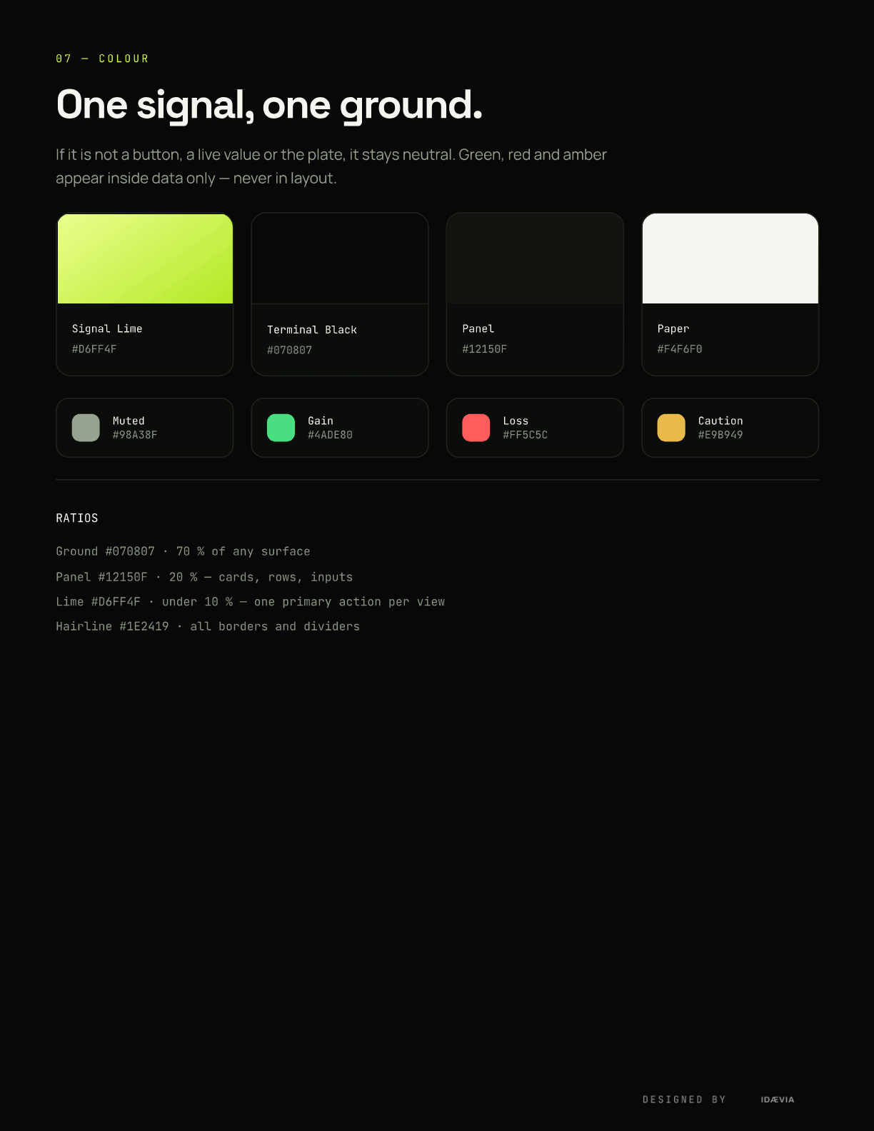
Lime marks action and gain and nothing else. Green, red and amber live inside data only, never in layout.
03
Numbers never lie
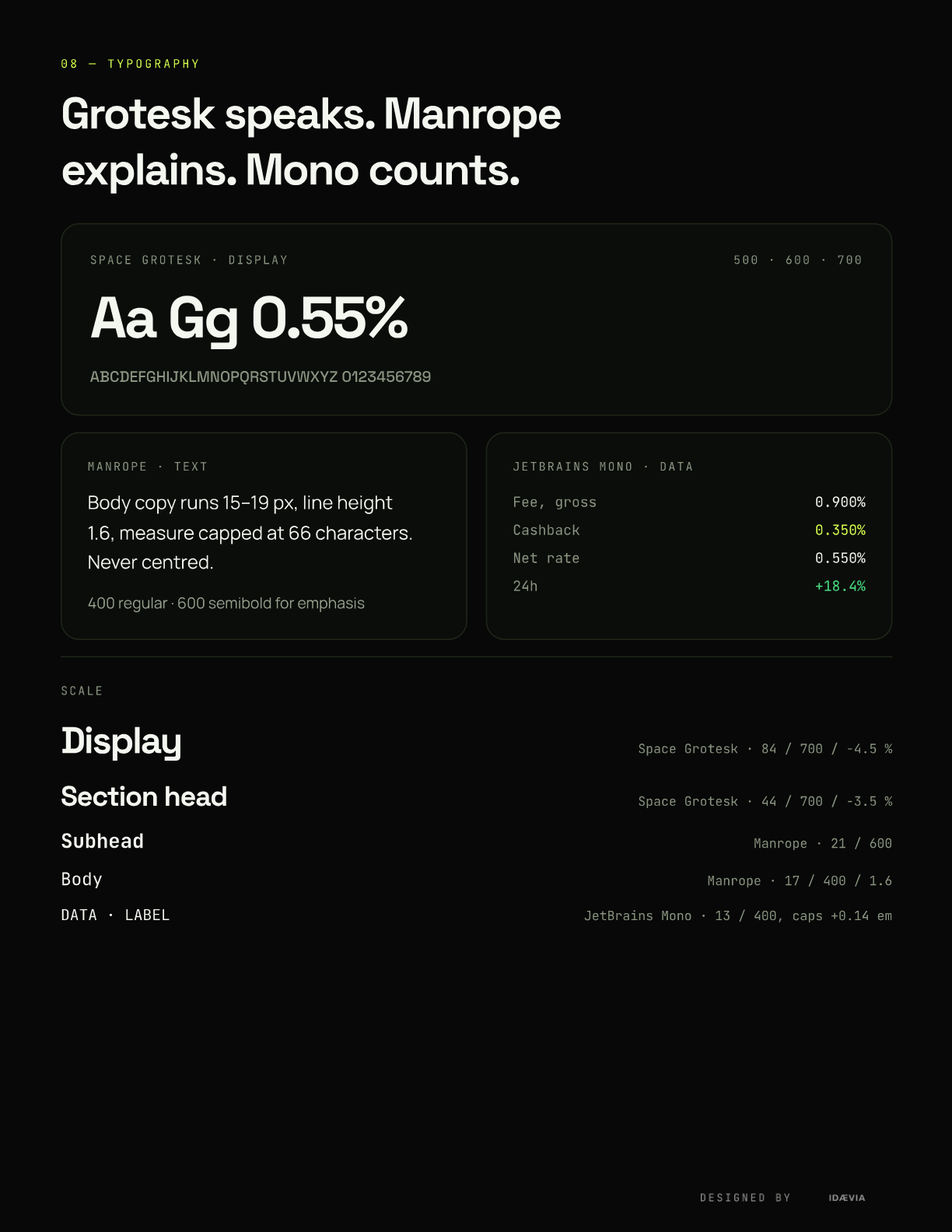
Space Grotesk speaks, Manrope explains, JetBrains Mono counts. Every rate is set in mono so it is never mistaken for prose.
04
Ready for product and print
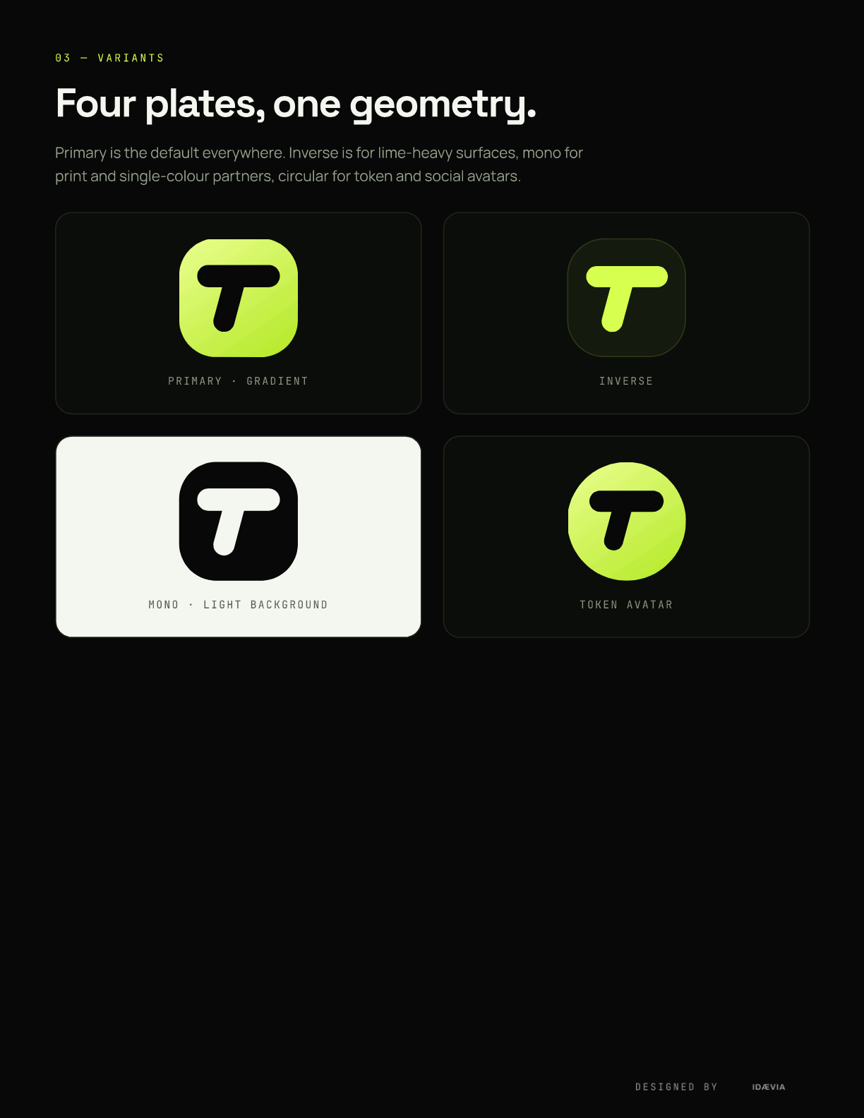
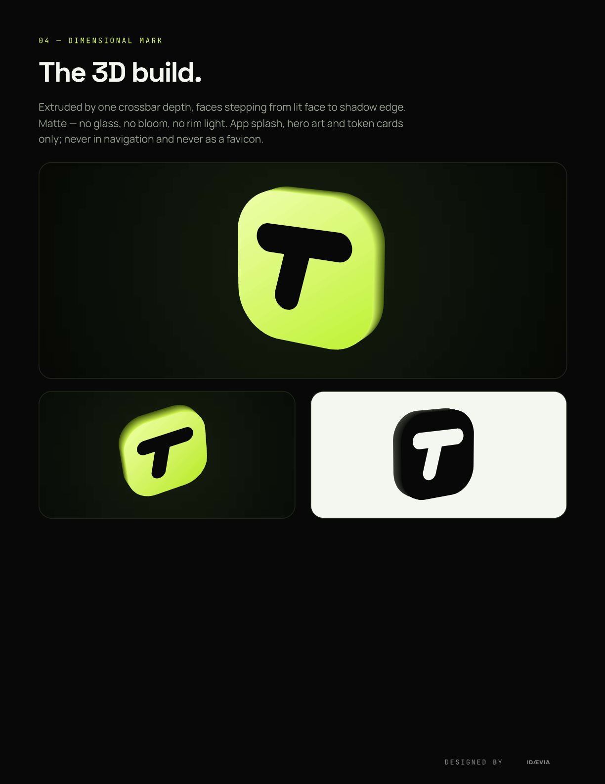
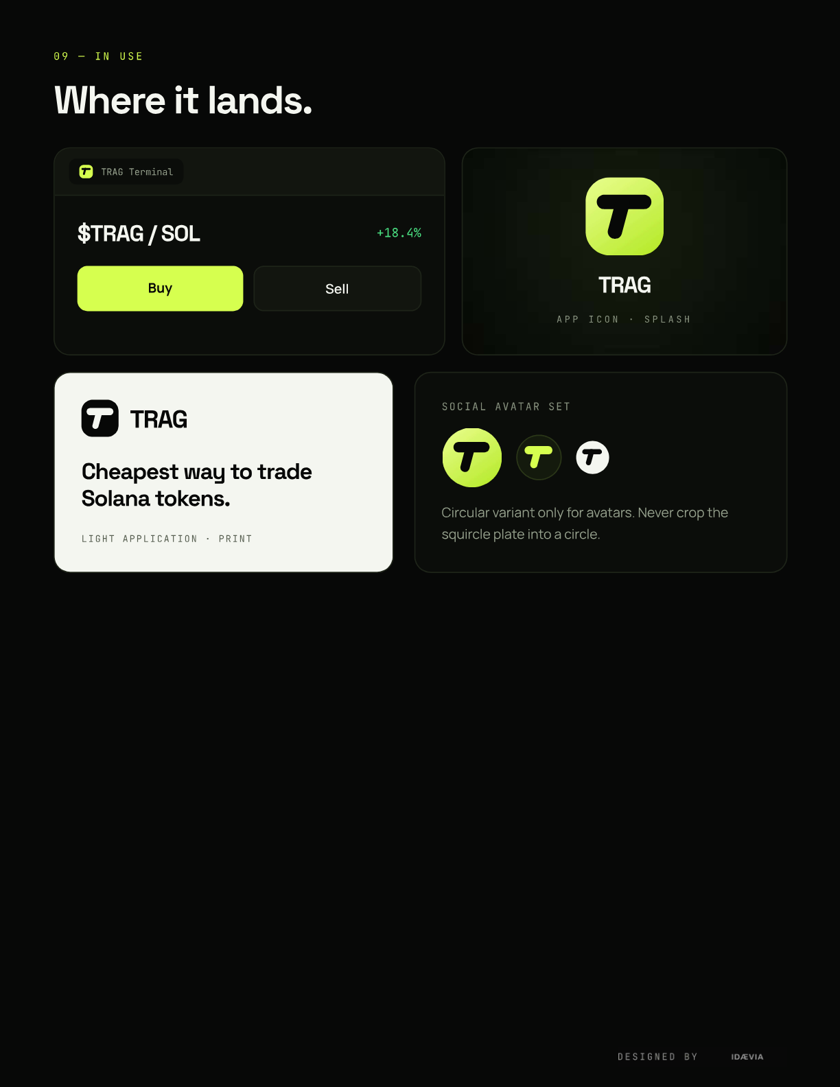
Four plate variants, a 3D dimensional mark for splash and hero art, light application for print, and a circular avatar for token and social.
Features
01
Two strokes on a squircle
02
Four plate variants
03
3D dimensional mark
04
Wordmark & lockups
05
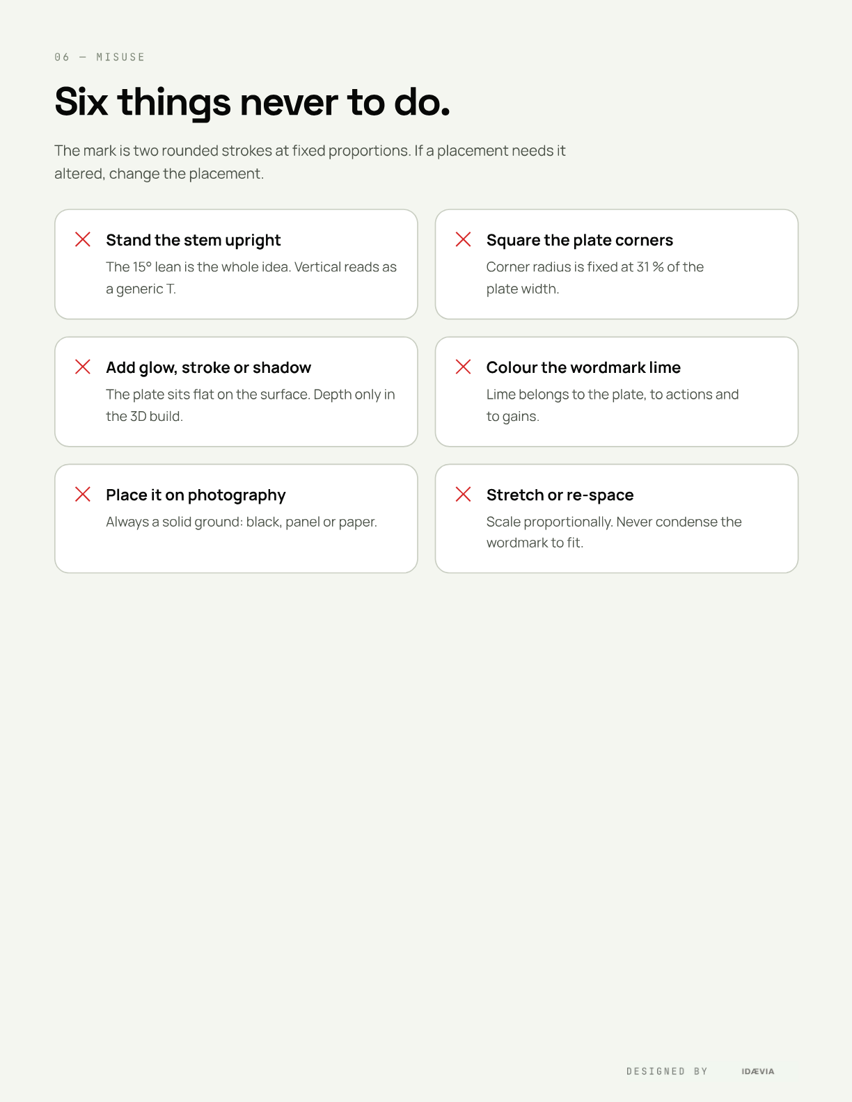
Six misuse rules
06
One signal, one ground
07
Space Grotesk · Manrope · JetBrains Mono
08
In-use applications
09
SVG + PNG asset index
FAQ
Is this the same TRAG as the trading terminal in Projects?
Yes. IDAEVIA designed the brand and built the product. The brand kit is the identity layer; the terminal is the case study under Projects.
What formats ship with the kit?
SVG vectors for the mark in every variant, 2x PNG rasters for the plates, avatar and lockups, plus the three open-licence typefaces.
WANT TRAG FOR YOUR BUSINESS?
Explore more