PERK SOCIETY
BRAND KIT / WEB3 COMMUNITYA complete brand identity for a Solana rewards community, built by IDAEVIA.
PERK Society is a community-driven rewards platform on Solana. We built the whole identity from scratch: the mark and logo system, the lime-on-void colour system, typography, graphic language, voice and tone, social templates and a full asset handoff, documented in a 10-page brand guidelines book.
Client
PERK Society
Sector
Web3 · Solana · Rewards
Deliverables
Brand guidelines (10 pages) + 11 logo and application files
Year
2026
Brand system
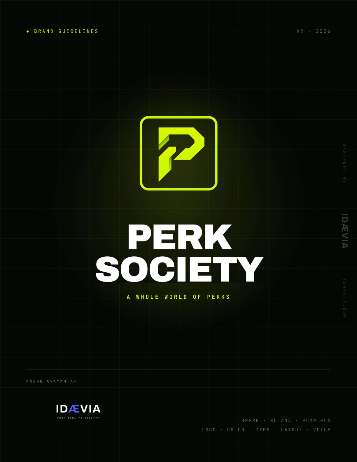
● Brand guidelinesV2 · 2026
P
PERK
SOCIETY
A whole world of perks
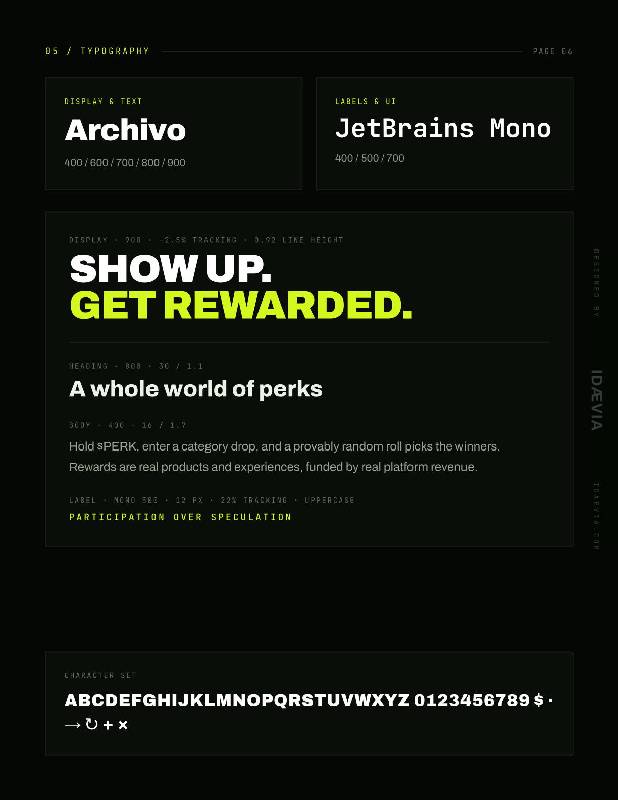
Display · 900 · -2.5% tracking
SHOW UP.
GET REWARDED.
GET REWARDED.
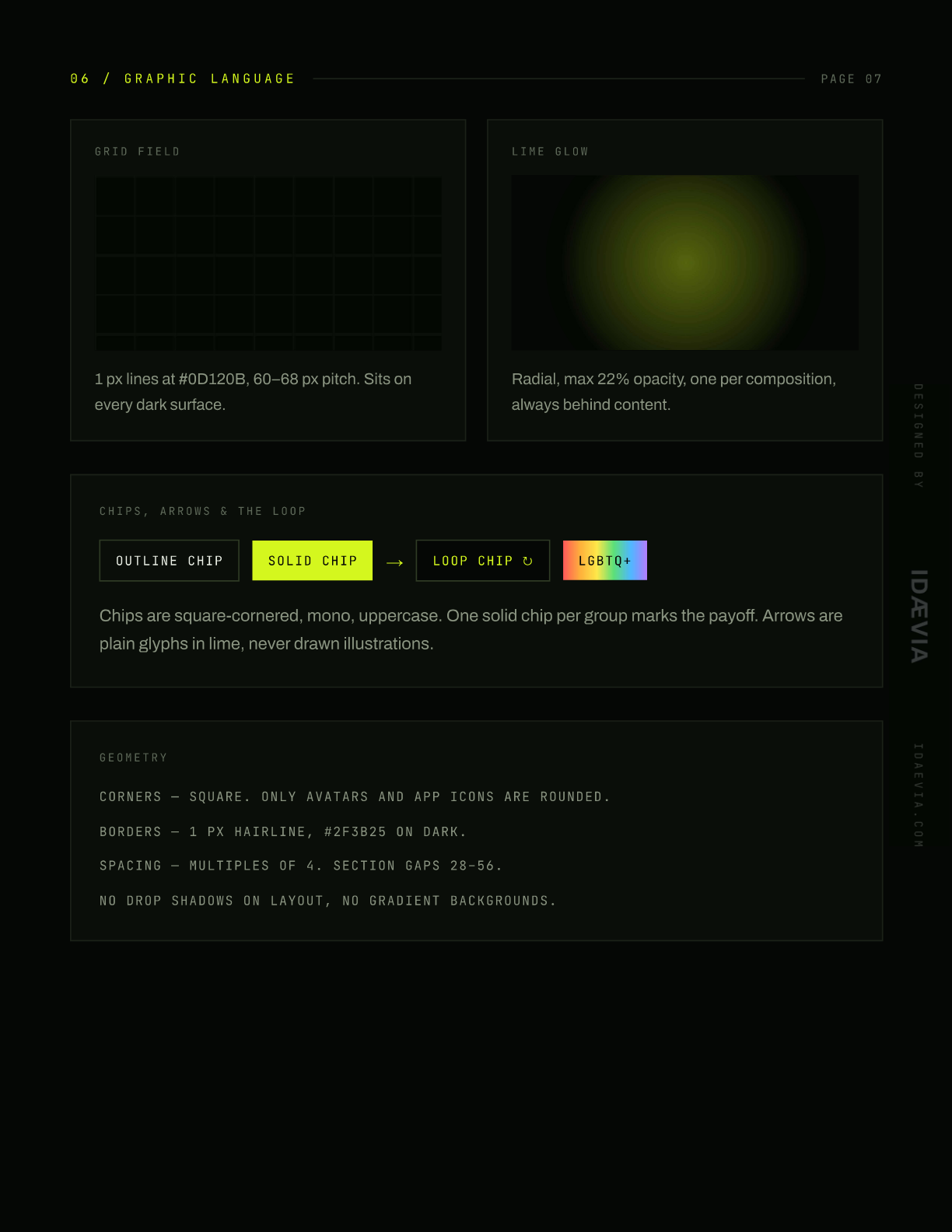
Outline chipSolid chipLoop chip ↻
P
P
P
Gallery
What is PERK SOCIETY?
PERK Society is a community-driven rewards platform on Solana. We built the whole identity from scratch: the mark and logo system, the lime-on-void colour system, typography, graphic language, voice and tone, social templates and a full asset handoff, documented in a 10-page brand guidelines book.
How it works
- 01Discovery and positioning
- 02Mark and logo system
- 03Colour, type and graphic language
- 04Voice, templates and asset handoff
What's inside
01
One mark, every size
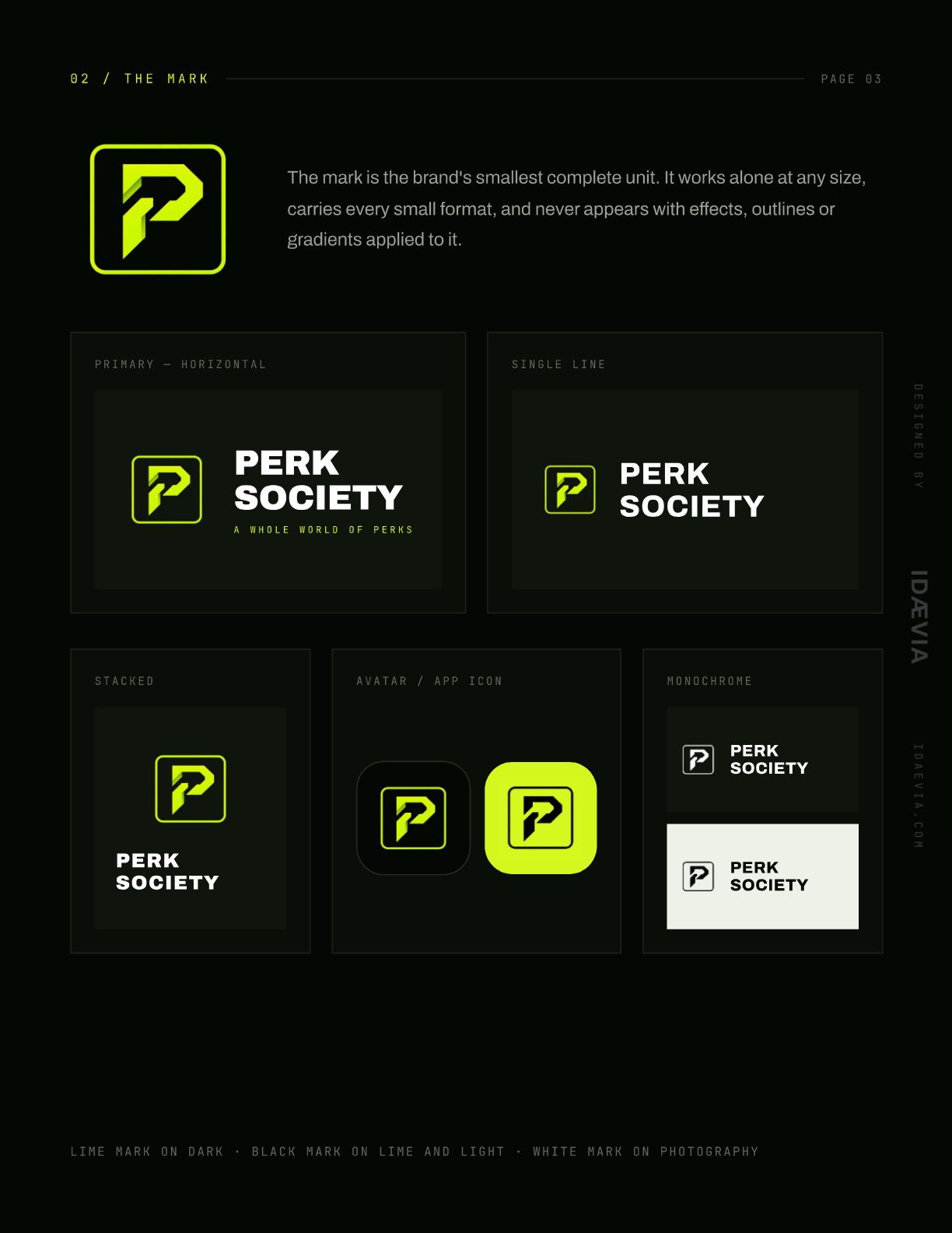
A bold P in a rounded square that works from a 24 px favicon to a festival banner, with lime-on-dark, dark-on-lime and monochrome colourways.
02
Lime is the accent, never the field
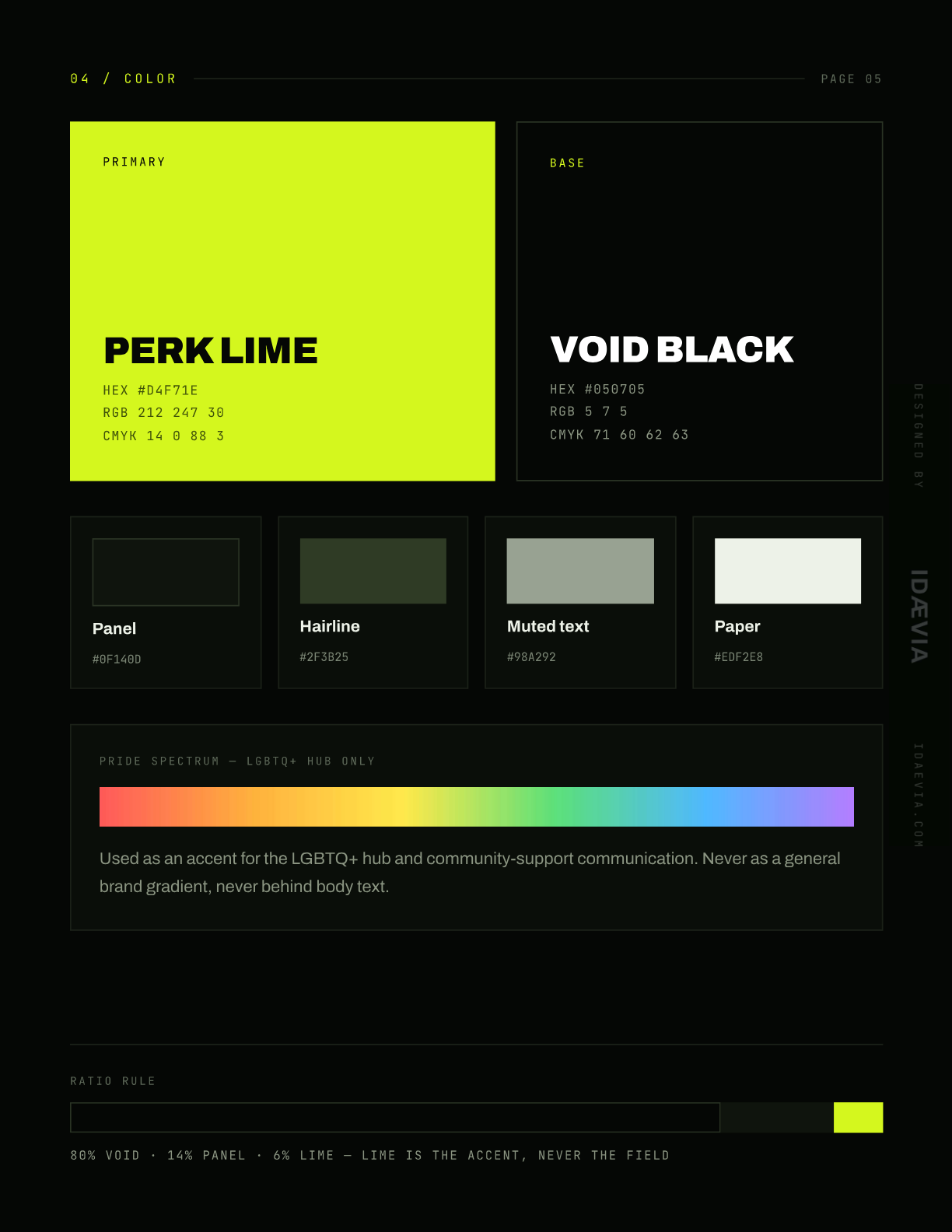
A strict ratio rule: 80% void, 14% panel, 6% lime. The colour hits hard because it is rationed.
03
Type with a voice
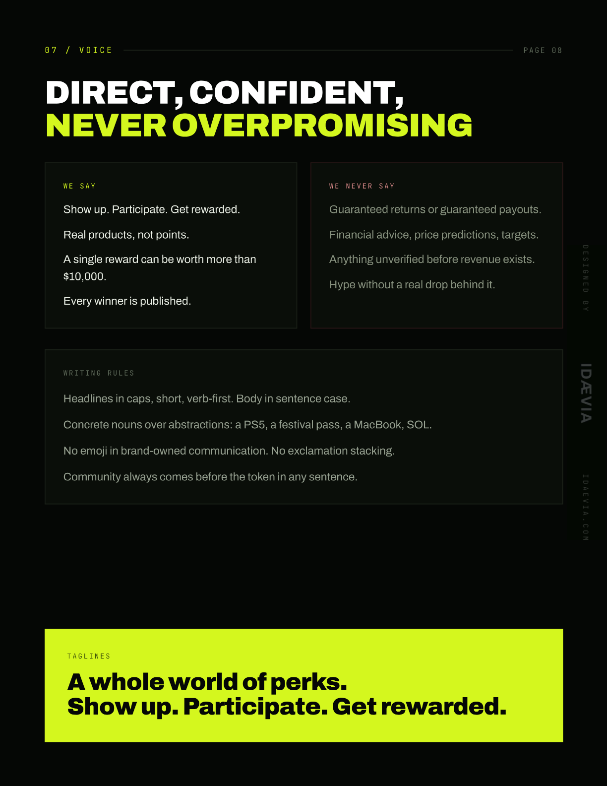
Archivo 900 for display, JetBrains Mono for labels and UI. Headlines in caps, short and verb-first; body in sentence case.
04
Ready to ship
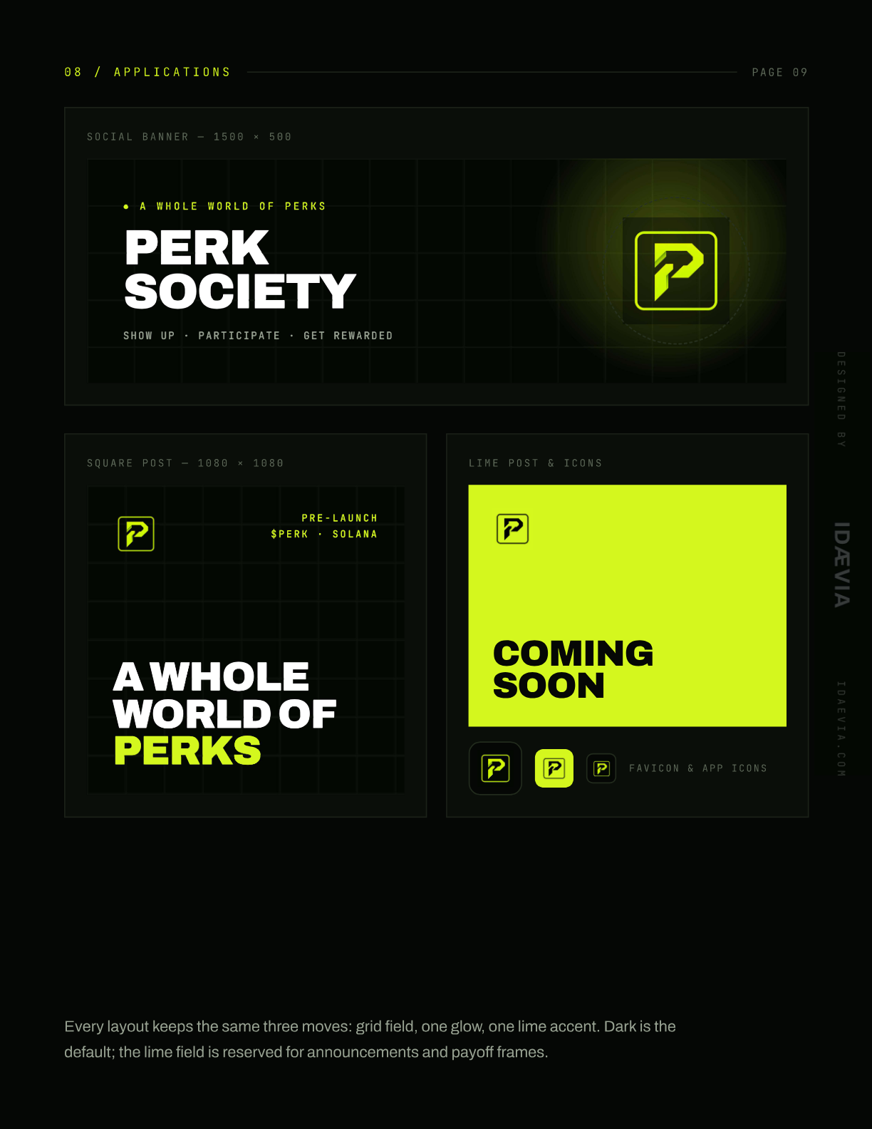
Social banners, square posts, app icons and favicons, plus a transparent-PNG asset index so the team can post on day one.
Features
01
Mark & logo system
02
Colour system
03
Typography
04
Graphic language
05
Voice & tone
06
Social templates
07
App icons & favicons
08
Asset index & handoff
FAQ
What does a brand kit from IDAEVIA include?
Positioning, the mark and logo system, colour and typography, a graphic language, voice and writing rules, application templates and a complete asset handoff, all documented in a guidelines book like this one.
Can you brand a product that does not exist yet?
Yes. PERK Society was branded pre-launch: the identity was ready before the token, the site and the first drop.
WANT PERK SOCIETY FOR YOUR BUSINESS?
Explore more